

Paco Roncero´s
Tapas sauces
Paco Roncero, one of the most awarded
spanish chefs and one of the key representatives of Madrid and Spain's vanguard cuisine, is the creator of two gastrobars, Estado Puro NH Paseo del Prado and Estado Puro en el NH Palacio de Tepa, that respond to his reinvention of the Spanish traditional Tapas Bar. He asked
me to design the packaging for a range of spanish tapas sauces to be sold
in these restaurants.


Paco Roncero´s
Olive oil´s range
Packaging for the range of Olive Oils
launched by the 3 star Michelin chef Paco Roncero. The product is only available in
his restaurants.


Carrefour
Selección
Creation of a graphic system for
Carrefour Premium range of products.
The system had to be easily implemented
in more than 300 references in a wide
range of formats, jars, boxes, cans, etc.
This work was done in Addison España,
being my role the design direction of
the project.


Tlc. Aromatherapy
Bath and Body Lotion
Design of a range of shower gels and body lotions. We wanted a container that was beautiful enough to stay on your bath
shelf even once the product was finished.
We created very simple porcelain bottles
that you could refill when needed.


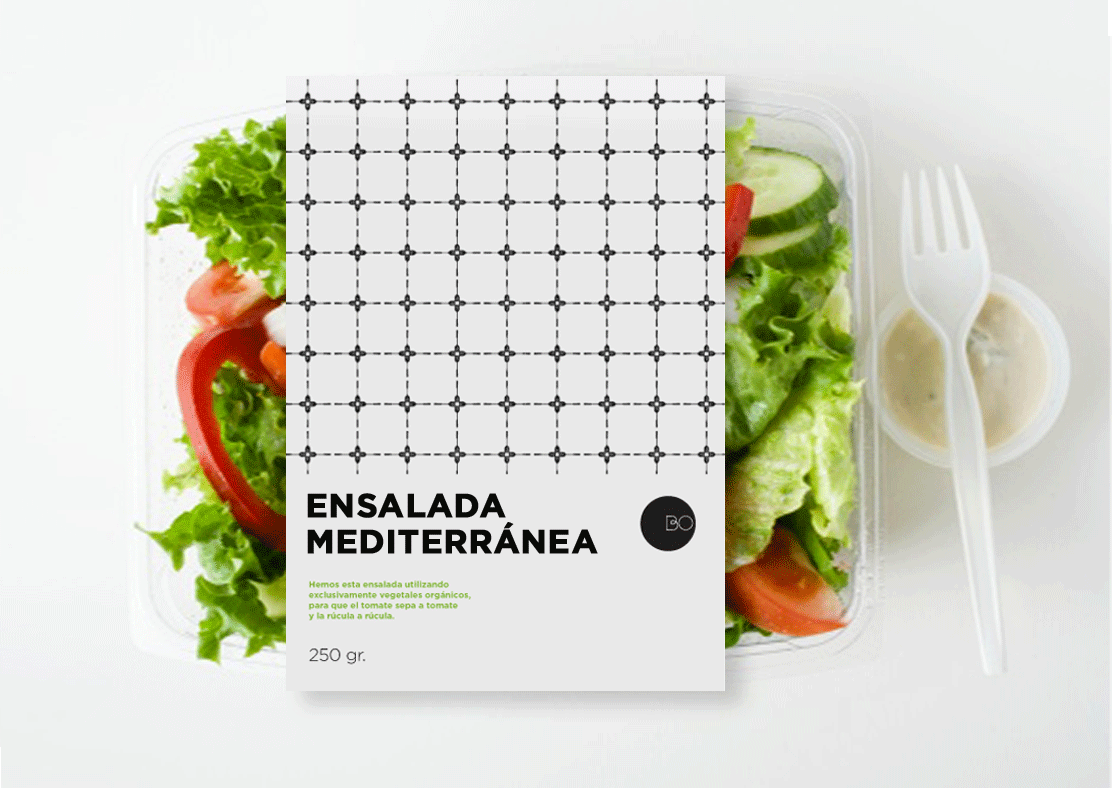
Bonamesa
Pret-a-porter meals
Identity and packaging for a new
brand introducing home made ready to eat meals. All their recipes are elaborated using only natural ingredients, they are free of preservatives or chemical color agents.
We wanted a simple, modern and bold identity that focussed on the key element of the product: home-made,
natural food, made for urban people.


Bermell
Spices
Bermell is an expert wholesale spices distributor based in Alicante, Spain. They source their spices from the exact regions,
to bring the best of the spanish flavours
to an international market.
We wanted the design to keep a traditional spanish feeling, but also to elevate it to a Premium level with a contemporary look.
We used graphic patterns based on traditional spanish tiles, and created a very classic logo. The combination of this two elements together with the use of "white"
in the graphic applications of
the brand allowed us to reach our goal.


La Leche!
Personal Project
We used common dairy packages to pack
our products, milk brick for the gel, glass bottle for the body lotion, condensed milk tubes for the hand cream, powderedmilk
can for the bath salts..


Campofrio
Pizzas with sauce
Campofrio was launching a new range
of pizzas which included an aditional
sacket of sauce with different flavours
so you could add it to your taste. It was specially targeted to teenagers.
They asked Addison to come up with a proposal that broke with ther usual
graphic style.
We played with the double meaning of
"salsa": sauce and music, and we create a family of characters, all salsa musicians.
We chose a silver material instead of the usual plastic blister. Unfortunatelly,
the client decided not to take the risk
and opted to keep their traditional style.


Docho
Stationery Retail
Addison España asked me to join them
to make the design proposal for a pitch involving the brand creation for a new stationary retailer in Spain.
Unfortunatelly, once the work was done.
the group decided to give up the business plan because of internal group political changes so the pitch was cancelled.
© 2013 by Justina Sanchis. Graphic Design. All rights reserved.
Branding / Packaging / Editorial